La peste
La Peste
Albert Camus
Gallimard
Paris
1947
8vo (190 x 130 mm)
Inv. 0540
Catalogue N. A484
Description
Bibliography
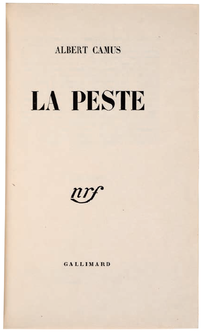
Albert Camus, La peste, Gallimard, Paris 1947
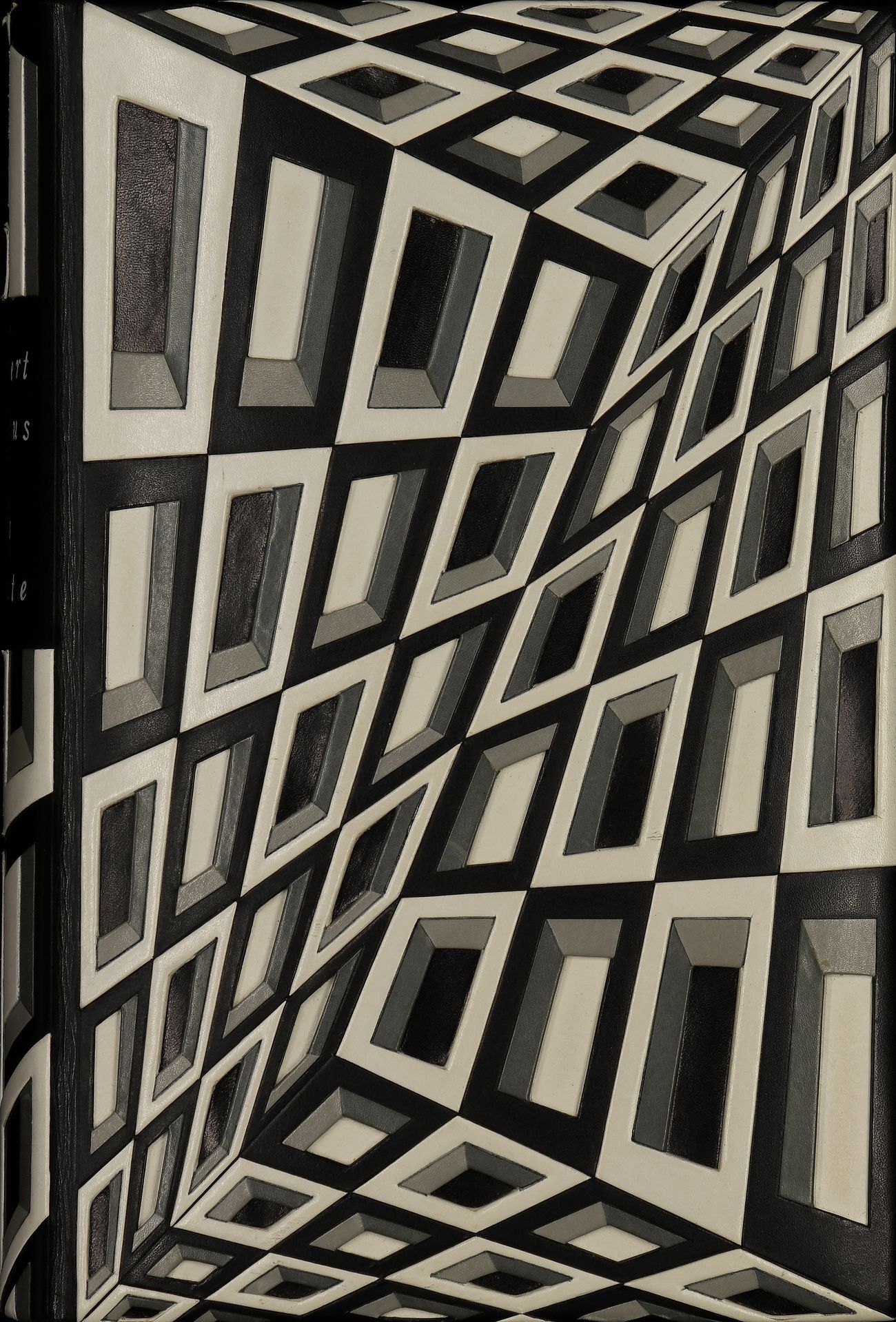
This binding was made in Paris and designed by Pierre-Lucien Martin. Martin was born in 1913 in Denault in Nièvre. Unlike Pierre Legrain and Paul Bonet, he was trained as a binder, as well as a designer. He attended the École Technique Estienne from 1927- 31 and was taught binding by Charles Chanat and design by Robert Bonfils. In 1931 he started working in the atelier of Jean Duval and then worked for several other binders; In 1936 he worked with A.-J. Gonon, in whose atelier he became familiar with contemporary poetry, painting and fine publications. In 1940 he set up his own atelier in Rue Saint-André-des Arts. After World War II he branched out in more original work and in 1948 won the 1er Prix de la Reliure Originale. He had come away from copying earlier styles (as had been demanded by some of his clients) and started to use geometrical shapes and juxtapositions of colour and form, often using lettering and creating what looked like three-dimensional designs, either with the help of onlays and mosaics or just with tooling. As demand for his work grew, he no longer bound himself but employed several forwarders, such as René Desmules, and used finishers, such as André Jeanne and Charles Collet, to carry out his designs. All three had also worked for Pierre Legrain.
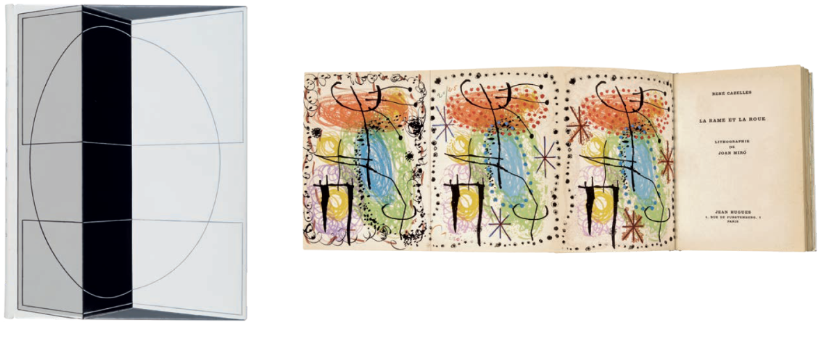
Fig. 1. René Cazalles, La rame et la roue-Joan Mirò
Messosi in proprio nel 1940 in rue Saint-André-des Arts, dopo la Seconda guerra mondiale dà al suo lavoro una direzione più originale, tanto che nel 1948 vince il «1er Prix de la reliure originale». Su sollecitazione di alcuni committenti, infatti, smette di imitare gli stili precedenti e inizia a far uso di figure geometriche e giustapposizioni di forme e colori, ricorrendo spesso a lettere e a disegni dall’apparenza tridimensionale, realizzati servendosi di inserti, mosaici o semplicemente attraverso la decorazione. Per soddisfare la crescente domanda di suoi lavori ricorre alla collaborazione di vari rilegatori, tra cui René Desmules, e di decoratori come André Jeanne e Charles Collet (tutti e tre già al servizio di Pierre Legrain), ai quali affida il compito di portare a termine i suoi progetti. Martin considera la legatura come una sorta d’introduzione al testo, che prepara il lettore al contenuto del libro e, nel caso dei volumi illustrati, tenta di realizzare una sintesi tra l’autore e le sue idee e lo stile dell’illustratore.
Fig. 2. Paul Eluard, Solidarité. Poème
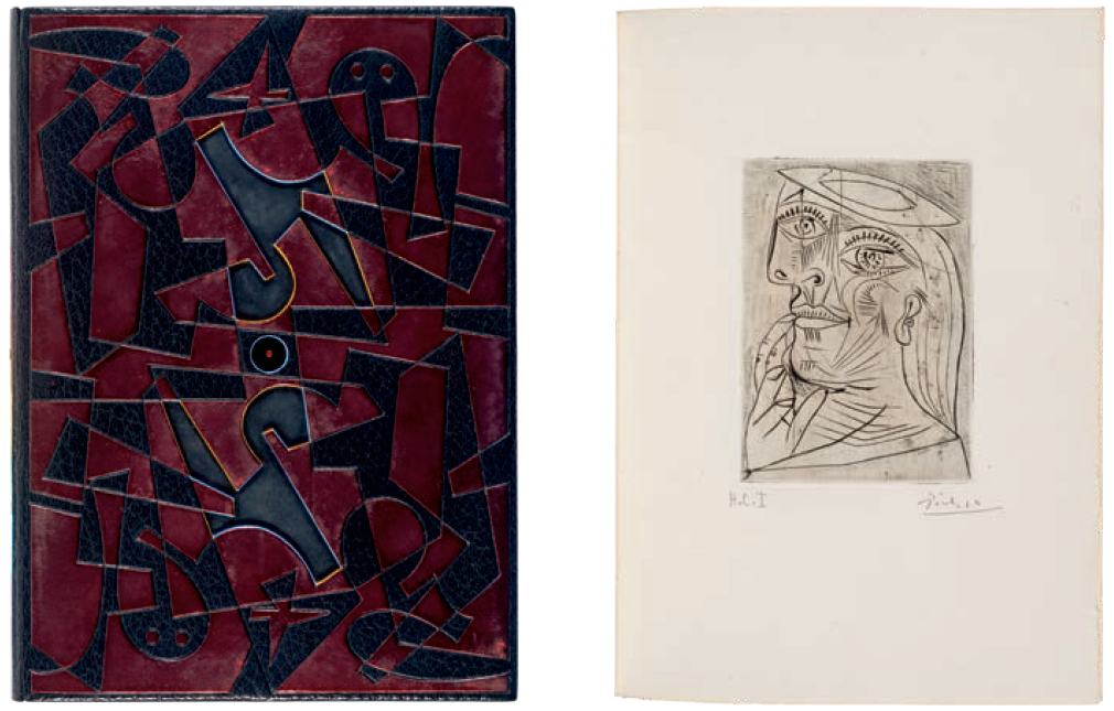
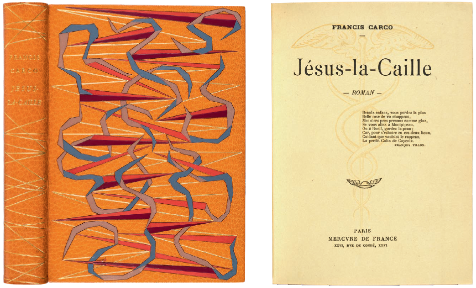
He considered the binding essentially as the entry to the text, its purpose being to prepare the reader for what is to come. For illustrated books he wanted to achieve a synthesis between the impact of the author and the ideas and style of the illustrator. His originality and imagination are expressed in all four bindings in the Cerruti Collection, the most striking of which is the binding on Camus, La Peste, with its geometrical trompe l’oeil effect; the binding on René Cazelles, La rame et la roue (Fig. 1) shows how a simple and restrained design can have an impact equally great as that of the more complex almost three dimensional design on the binding of Paul Eluard, Solidarité (Fig. 2), while the exuberance of colour on Carco, Jésusla- Caille (Fig. 3), shows yet another aspect of the imagination of this remarkable designer. He died in September 1985.1
Mirjam Foot
1 B. D. Maggs, in New York 1999, no. 103. See also Devauchelle 1959-61, vol. III, pp. 270-272; Blaizot 1987.
Fig. 3. Francis Carco, Jésus-la-Caille Roman

